

FRIEZE WEEK REVIEWS
Paul McCarthy at Journal Gallery, David Salle at Sprüth Magers, and Dustin Hodges at Sebastian Gladstone
It’s been an insanely busy Frieze week in LA this year. Other than Frieze, Felix, and Post, there was Enzo, a new fair for smaller dealers, the Rita McBride show in the Neutra-designed Scheyer house, the opening of the Julia Stoschek Foundation, and endless openings. It has been packed.
I was slammed setting up a big group show in an abandoned Sizzler, so I didn’t manage to cover a ton of ground. I’ve reviewed a few things I did see below.
If you came to Sizzler, thank you! The opening was so wonderful, a seven-hour marathon of meeting new people and exploring the artists in the exhibition. Installation images from the exhibition are now up at www.sizzzzler.com. It will run through April 12th, open Wednesday through Saturday from 2pm-6pm. If you haven’t see it yet please come by!
Thanks for subscribing to Camel. This post is my one free article a month. For only $5 a month, you can get access to all of four monthly posts. Or, save 15% if you subscribe for a whole year.
I deeply value the feedback of my readers and hope that Camel can help spark conversations about what we can do differently as artists, dealers, writers, etc to support an improved artistic environment. Don’t hesitate to comment, message, join the chat, or email me!
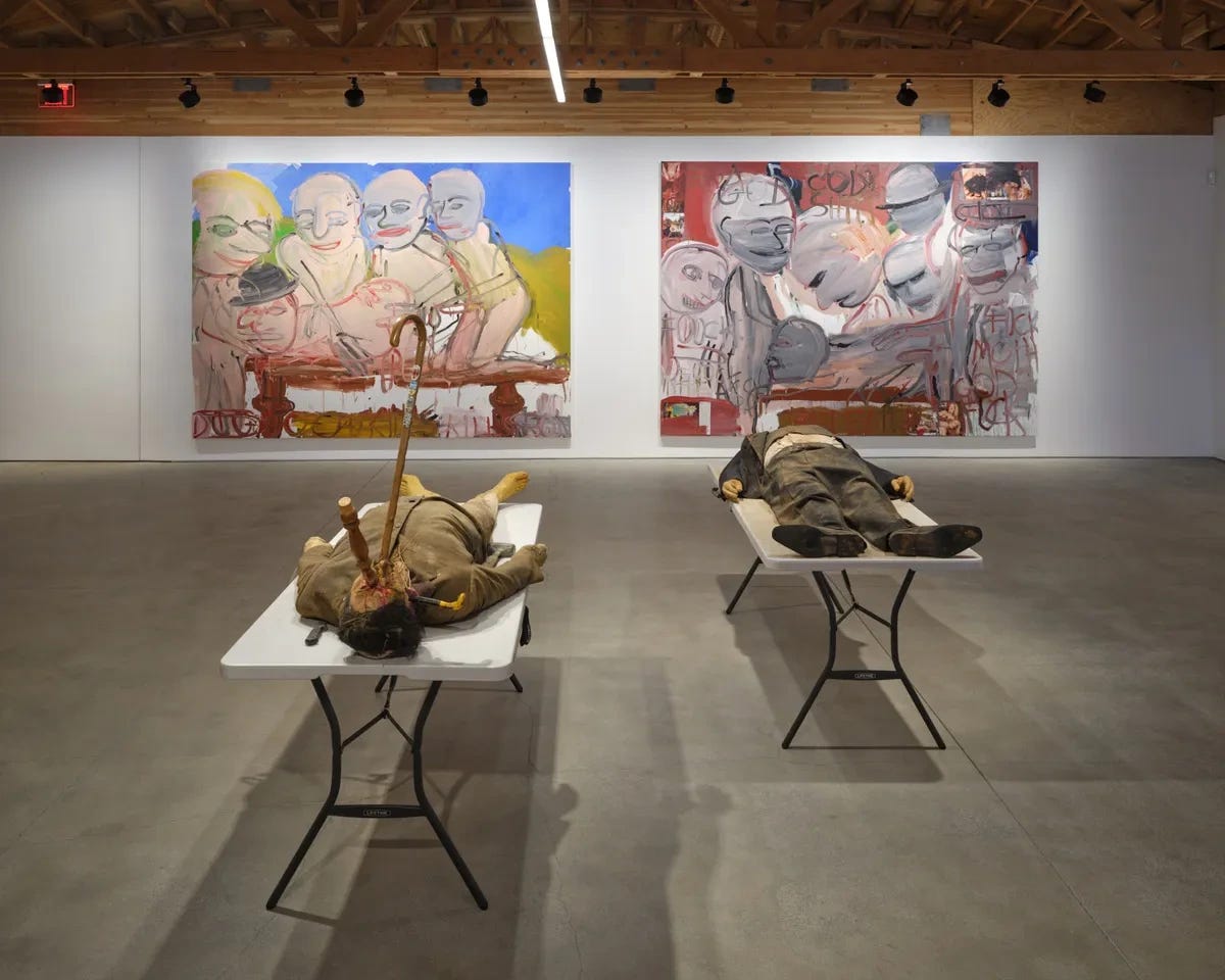
PAUL MCCARTHY AT JOURNAL GALLERY
The crowd of Frieze attendees parted and revealed two dead bodies on folding tables. One had his head pointed towards the door. A cane was rammed through his mouth. The broken leg of a chair split through his skull between the eyes. Another cane jammed through his right ear. The other dead man had his feet pointed towards the door. It was less clear what killed him.
They had the immediate quality of props. It didn’t take a close inspection to see the artifice of the hair and skin. The one impaled with numerous household objects was Hitler. He was dressed in what looked like pajamas. The cane looked old, maybe at one time it was used as a real cane. It had small emblems pinned to its staff that depicted a crest with a two-headed eagle and pastoral Germany. I’m not sure who the other man was supposed to be. He was dressed in an antiquated suit and vest. His face seemed deteriorated, made of mud. The title provides clues: CSSC Banker, Ronald, Blood Dirt Face.
Surrounding the bodies on the table were six large, crudely painted canvases. Some had torn pages of porn stuck to them. All depicted scenes of graphic violence and/or animalistic orgy. Most had words painted on them: “GOD SHIT FUCK MOTH GOD FUCK” or “MOUTH CUNT FUCK PRICK CUNT FUCK CUNT,” and so on.
In the front were seven drawings on paper, each playing on Adolf/Adam & Eva/Eve. In almost all of them, Eva/Eve is murdering Adolf/Adam and chewing off his penis.
I ask a friend who makes abstract paintings what she thinks. “He’s canon.” She asks me what I think. I’m not a fan. Admittedly Paul McCarthy’s work gets stuck in my head. It’s supposed to. It’s supposed to shock, that’s what I would say is wrong with it. Shock is cheap. But no one there is shocked. And they like it anyways. Everyone laughs and smiles. What do they like about this? It’s just McCarthy being McCarthy?
The rhyme of Adolf and Adam, Eva and Eve got stuck in my head. McCarthy’s work wants to drag its viewers into the abyss. There’s something to be said for that. But does it still happen? The attendees looked comfortable and ego-normalized in their jackets and heels.
This work is not as offensive as it would like to be. Its strategy of protest is 50 years old. It’s part of what I think of as tantrum art. It avoids nuance by unbridling taboos. Shock value sacrifices meaningfulness for attention. It comes all at once and then no more, like a club to the head. McCarthy is canon. His works no longer need to shock. Everyone will laugh and smile anyways.
DAVID SALLE AT SPRÜTH MAGERS
Almost all busts. It felt easy that bosoms would be on display for Frieze week. Out of 16 paintings, 10 focus on the chests of women, their faces out of frame. Two are men.
Salle has been making AI-generated images based on his own work, printing them, and painting into them. Compositionally, there is variety. But almost every work centralizes a torso. If you asked AI to tell you what to show for Frieze week it would probably say women’s chests. One looks like a flight attendant uniform, another is military. Another wears a nightgown. There is a bust in a black tank top with a red blazer. There is a headless sculpture of Venus.
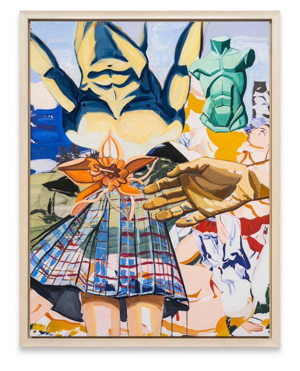
The more interesting compositions are less predictable. In New Pastoral Green Torso the skirt of a woman collapses into an inverted sculpture of a male torso, the collision marked by an incompletely rendered orange lily. A disembodied hand reaches in front the right towards it. The hand obscures another woman reclining at bottom right. She gazes towards the sky.
Salle’s work generally makes me think of Édouard Manet in its fractured narratives, its compositions that pastiche disparate characters, objects and places into kaleidoscopic amalgamations.
But this show didn’t feel energized by Salle’s experiments with AI. Rather it seemed to allow him to move more quickly through his compositions. The UV printed linen behind his paint has a deadened quality, exaggerated by the palpable physicality of the paint on top. His subjects felt arbitrary, tuned to the function of the occasion instead of the internal needs of the works.
DUSTIN HODGES AT SEBASTIAN GLADSTONE
Hodges presented a suite of eight new paintings at Sebastian Gladstone’s Santa Monica gallery for the occasion of Frieze week. Gladstone previously presented a solo booth of Hodges’ work in 2023 at Frieze LA.
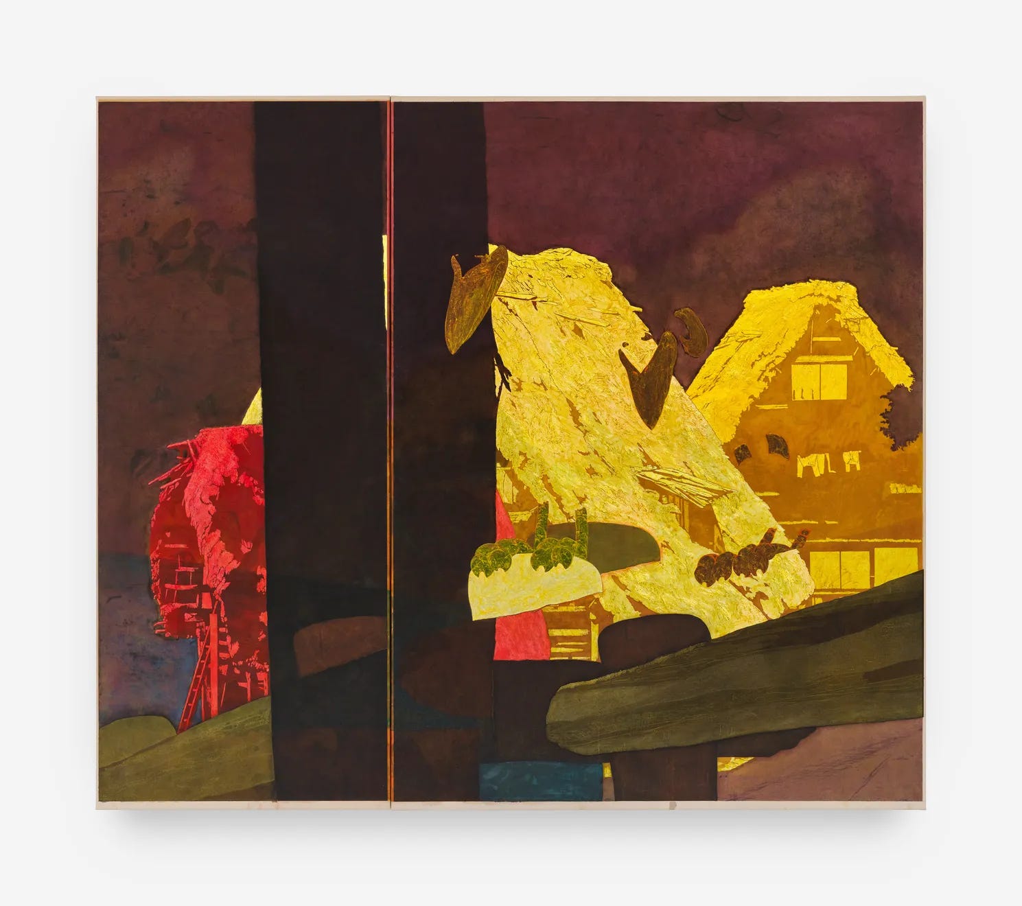
The overwhelming tension in this show regards the relationship of the formal quality of the works against their content. Each canvas is a permutation on two simple motifs: a pastoral thatched peasant house, and vultures from the original Dumbo film. They feel specific even if the viewer doesn’t know what they are. But why these images in particular? Hodges is one of those artists who seems to draw on reference motifs as a springboard for formal inquiry. But as always with that strategy, the question comes around what ultimate purpose the references serve.
Take Barley Patch #6. It depicts a foggy pastoral landscape with Hodges’ thatched-roofed barn, rendered in lemon and honey yellows, and a fence in the foreground. A vertical smear interrupts the directional geometry of the fence as it splices off the right quarter of the composition. The fence is murky to the point of dissolving into paint. The stark grey sky looms over the whole picture with imposing flatness. It is the most empty picture in the exhibition, apart perhaps from LEP_81, which lacks basic compositional trajectories.
#6 is counter to Barley Patch #7, which shares a basic structure but features a deeper foreground with Hodges’ vultures encircled in the bottom right quarter. The numbering in the titling suggests a definite sequence. First the stage is set, then the actors take their place. But if there is any objective narrative, that is its full extent.
Barley Patch #4 presents another variation on the same composition. Again the fence, again the thatched roof in the background, again the sneering vultures in the foreground. Again the picture is ruptured by a vertical shaft, this time cutting and stitching the canvas literally into two panels.
Are his references and suggested narratives meaningful in the experience of the work or are they merely motors for formal exposition? Or are they guardrails for the artist to avoid the nakedness of pure formalism? One wonders how Hodges’ changing characters from one body of work to the next diverts attention from his formal development or lack thereof.
Hodges regularly leaves his references incompletely rendered. Again, it seems to speak to an innate drive towards the formal or material directness of the paint. But these marks’ attachment to their references restricts their ability to speak for themselves. The rocky outcropping behind the vultures in Barley Patch #7 is little more than a glimpse. Its fragmented splotches do more to suggest what is absent than take on an agency of their own. In Barley Patch #4, LEP_83, and LEP_85, the heads of his vultures are reduced only to beaks. Their bold color relationships are more assertive than their form. Their form functions as a placeholder of the character that is not fully present. The thatched barn in LEP_80 feels is a ghost, flickering the loose contours of its shape behind the spotlight. But as marks of paint on canvas they possess no internal authority.
Hodges is split between impulses. What makes his work enjoyable is his fantastic sense of color and his capacity for compositional reservation. But the formal potential of the works that is motivated by his references is ultimately restricted by them in the end. Why should these paintings be? It is certainly not for what they depict. If Hodges’ materiality, compositional intuition, and color are his promise as an artist, he must free himself from habits which do not ultimately translate into aesthetic persuasiveness.